Why should you analyse mobile traffic?
As a website owner or marketer, you need to know how to analyse mobile traffic on your website. This allows you to understand the behaviour and preferences of users on mobile devices.
Your audience is likely to use mobile devices – a lot!
It is estimated that over 50% of global web traffic comes from mobile devices; not surprising when every person in the street seems to be glued to a mobile phone! Additionally, more than 3.6 billion people around the world use social media, with the majority accessing these platforms via mobile phones.
By analysing mobile traffic, you can gain insights into user interactions, engagement metrics, and conversion rates specific to mobile users. This helps you identify areas for improvement and develop strategies to enhance the user experience on mobile devices. This information is also invaluable for optimising your marketing campaigns that drive traffic to your website, and lead to conversions.
Google Analytics 4 (GA4) allows you to track and measure different aspects of mobile traffic, helping you make data-driven decisions for your website and your marketing campaigns.
The importance of a mobile-friendly website
A mobile-friendly website is important for 2 reasons – optimal user experience and better SEO performance.
Mobile users expect a seamless browsing experience with easy navigation, fast load times, and responsive design. A user-friendly mobile website enhances engagement.
By analysing mobile traffic using GA4, you can gain insights into user behaviour on your mobile website. This data allows you to identify pain points, optimise user flows, and enhance the overall user experience. Furthermore, a mobile-friendly website leads to lower bounce rates, increased time spent on site, and ultimately, higher conversion rates.
SEO crawlers are constantly scanning websites to gather information and assess their relevance for search engine rankings. These crawlers prioritise mobile-friendly websites, as they understand the growing preference for mobile browsing. By providing a seamless mobile experience, you increase the chances of your website being indexed and ranked higher in search engine results.
5 ways to analyse mobile traffic in GA4
- GA4 Tech reports
This is where you will answer the question ‘what number/percent of my website visits are from mobile vs desktop vs tablet. It’s important to know whether your audience is predominantly on mobile or on larger screens when planning and designing new pages. For example, I know that tables in my blog posts don’t look great on a phone screen, so I avoid using tables. - Comparisons
A comparison lets you see 2 or more sets of data together on a page, e.g., traffic acquisition for ‘mobile’ versus ‘all users’. This particular comparison will help you to plan strategies for acquiring website visitors. You can design all sorts of comparisons to answer all sorts of questions – use your imagination! - Secondary dimensions
Adding a secondary dimension to any table report in GA4 applies a second level of breakdown. For example, when looking at the pages report, the first breakdown is by page path. Adding a secondary dimension of device category helps you to identify variations in user behaviour across mobile, desktop and tablet. - Exit report by device category
‘Exits’ is a metric available in the Explore reports but not in standard GA4 reports. This tells you which pages were the point of exit from the website. When broken down by device category, you can see whether some pages have a higher rate of exit when viewed on mobile. You could look into whether these pages are not designed well for the mobile format. - Pathway exploration with a breakdown to examine mobile traffic
This is another report available in the Explore reports but not in standard GA4 reports. It allows you to explore the pathways that users took through your website. It is not the kind of report that you should print, as it changes dynamically as you head down one path and then another. Do people follow the pathway that you would expect? If not, what is stopping them?
Now let’s look at how we can see each of these views.
1. Using Tech reports to understand mobile traffic
For a breakdown of your traffic by mobile, desktop and tablet, open the Tech details reports and use the drop-down to change the dimension from the default of ‘Browser’ to ‘Device category’.
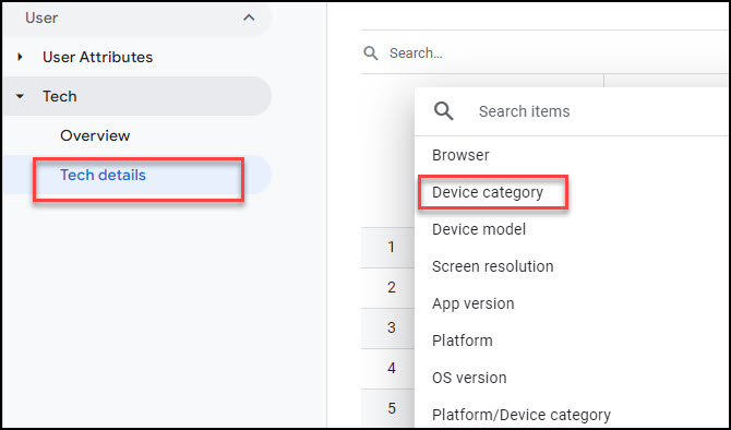
I have customised some of the columns in the resulting table. I have swapped ‘Conversions’ for ‘Session conversion rate’.This makes it easier to see how the device types compare when each has a different number of sessions.

The table shows that mobile traffic accounts for the majority of website visits, but desktop traffic has a slightly higher conversion rate. If this trend continues, you could look at how you could improve the conversion rate on mobile devices.
2. Using Comparisons to understand mobile traffic
Users of Universal Analytics will remember Segments. GA4 doesn’t have segments in the main reports (they are available when you create reports in ‘Explore’). However, GA4 has Comparisons, which are essentially the same thing.
A Comparison is a good way to compare the behaviour of one segment of users with that of all users. It helps you identify any significant disparities in user behaviour and trends. This is particularly useful when you want to understand how mobile traffic differs from overall traffic.
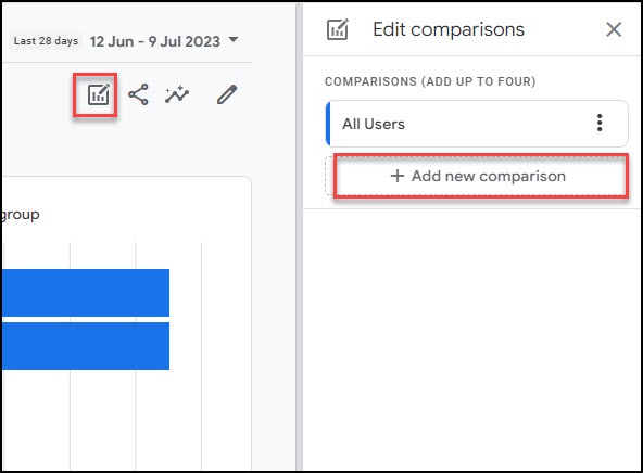
To create a Comparison of mobile users versus all users, start in any report, find the set of icons at the top right, click the left-most icon, then choose ‘Add new comparison’.
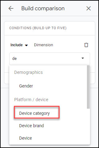
The dimension you need to specify is ‘Device category’. You can search and select it:
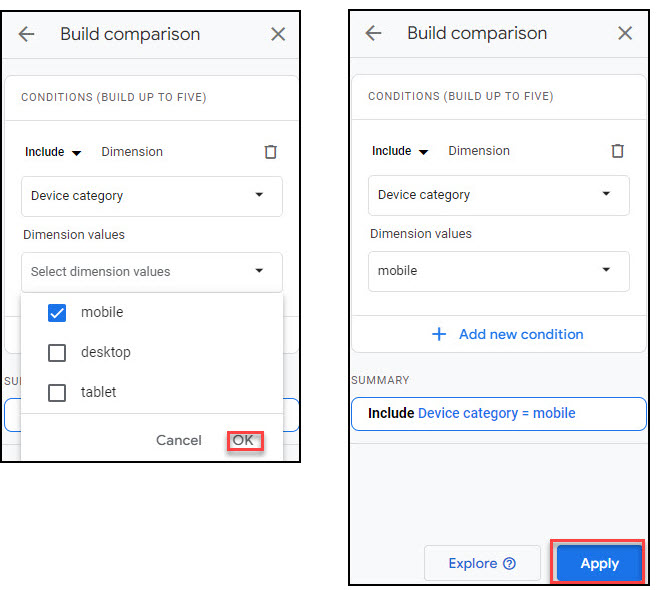
Choose ‘mobile’, click ‘OK’ and then click ’Apply’:
The reports now show both the mobile segment and all users, differentiated by colour.
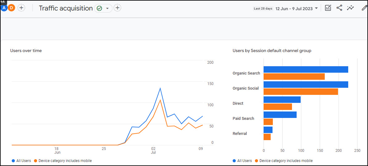
These charts show me that:
- mobile users make up most of the website traffic
- these people are more likely to come to the website from social media platforms and less likely to come from paid search, compared with all users.
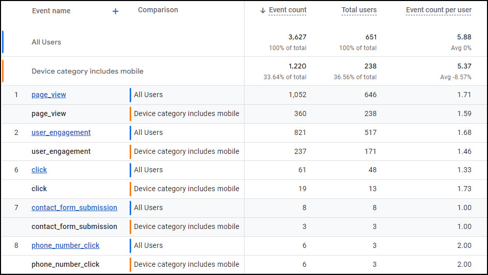
Tables are expanded in the same way, making them a little harder to read but offering a wealth of information. The table below is the Events report, showing both standard events tracked by GA4 and some custom events. By setting up custom events, you can track specific user actions, such as clicking or tapping on buttons, form submissions, or video views. This data allows you to understand how users engage with your mobile website, helping you identify opportunities to optimise user flows and improve conversions.
If you wanted to take Comparisons to the next level, you could add further conditions, for example, compare user behaviour between Apple mobile devices and Samsung mobile devices.
Once a comparison is applied, it persists as you navigate from report to report, until you remove it.
3. Using Secondary dimensions to analyse mobile website traffic
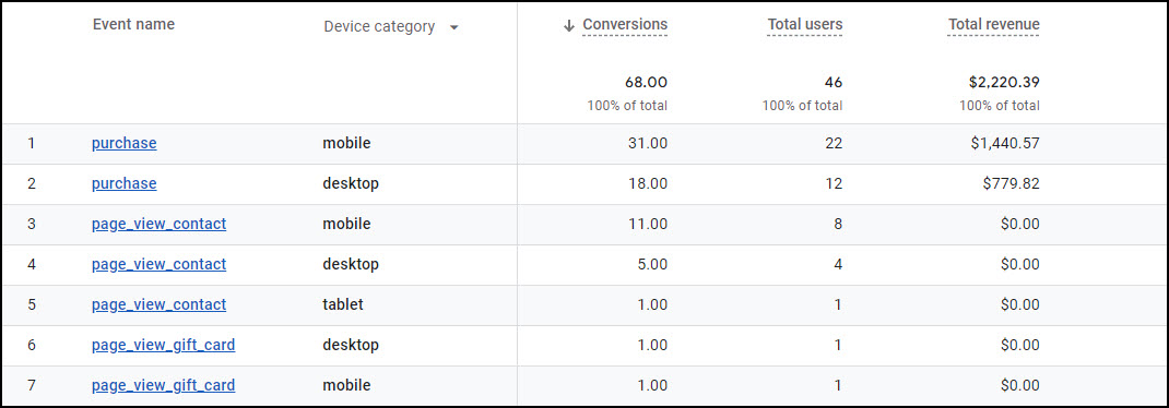
Secondary dimensions are applied to table reports. The first column (the default dimension) has a blue plus sign on its right. Click this and you can select a secondary dimension. Choose ‘Device category’ to apply a further breakdown by mobile, desktop and tablet. This kind of table can help you to spot differences in behaviour between users on different categories of device.
4. Using an Exit report to analyse mobile web traffic
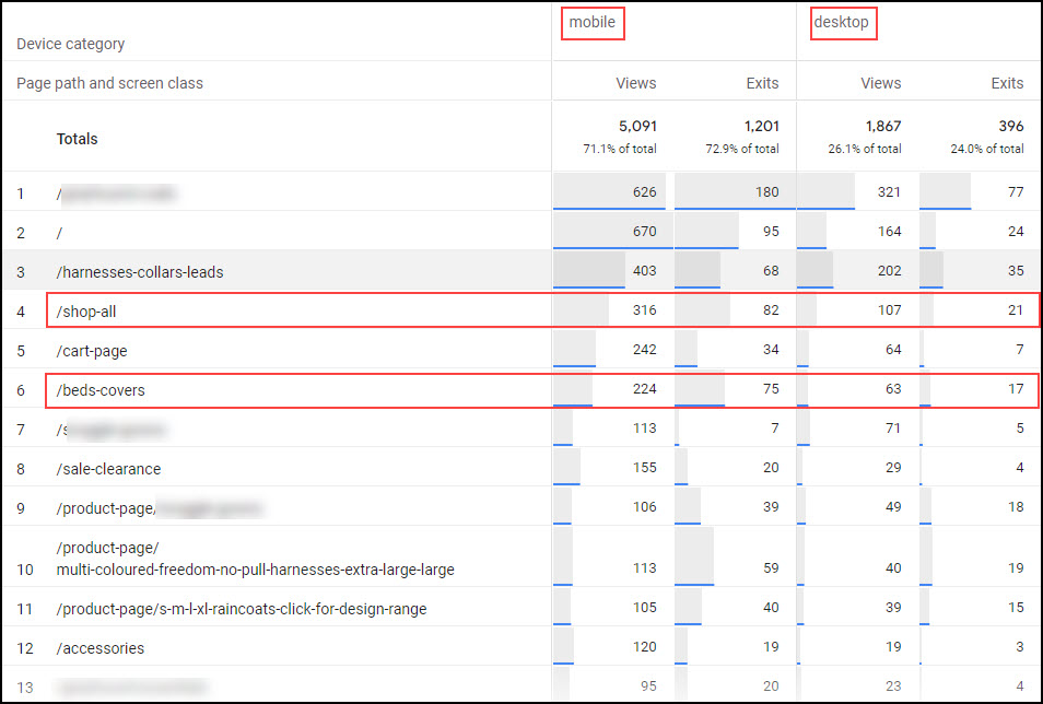
The metric ‘exits’ is not available in GA4 standard reports. So, head over to the Explore section in the main menu and start a new blank exploration. The variables section will be empty. Add the dimension ‘Page path and screen class’ and ‘device category’ and drag these over into ‘Rows’ and ‘Columns’, respectively.
Add the metrics ‘Views and ‘Exits’ and drag these over into ‘Values’.
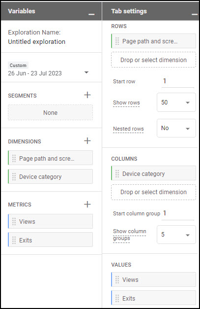
The resulting chart shows you where the rate of exit is different on mobile devices. In this chart I can see a few pages where the rate of exit is higher on mobile devices than on desktops. Could that be because these pages are not user-friendly on a mobile device?
5. Using a Pathway Exploration to understand mobile traffic
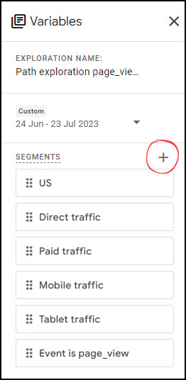
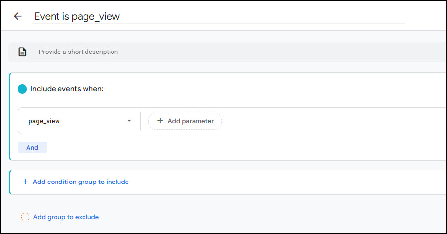
There is no ‘one right way’ to use the Pathway exploration. It has the capability to show sequences of events or sequences of pages visited. If I want to explore sequences of pages visited, I create a new Pathway exploration and first create a Segment of page_view events. I do this because I want my chart to show only pages that were visited, not all events. To create the Segment, click the plus sign beside ‘Segments’ in the Variables column:
Then specify the segment like this:
Then, on the right, I clear the default chart by clicking ‘Start again’ on the top right of the screen:

Choose ‘Page path and screen class’ for the starting point:
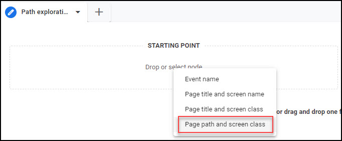
Then choose the page path where you want to start your exploration, for example, ‘/’ for the home page. This will show you the pages that people visited after the home page (whether at the start of the session or at any time they were on the home page).
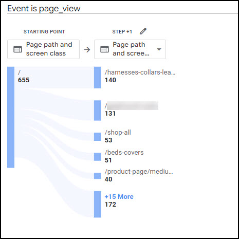
You can click on any of the pages in the right-hand column to see where people went next. Clicking again will collapse that branch, and you can explore another branch.
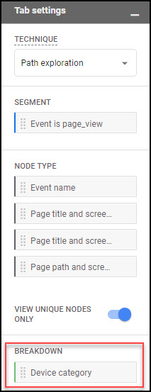
Now, to see mobile traffic compared with other traffic, go back to the Settings on the left and chose ‘Device category’ as Breakdown in the Tab Settings column:
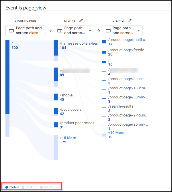
Now you will see ‘mobile’, ‘desktop’ and ‘tablet’ at the bottom of the chart. Hover over ‘mobile’ and just the mobile traffic will be highlighted.
Mobile browser versus mobile app traffic
When setting up Google Analytics 4, it’s important to know that mobile browser and mobile app traffic are tracked differently.
If you have a website but not a mobile app, you will set up GA4 to track only web traffic. This will track traffic that comes via any browser, whether this is on a desktop, tablet or mobile device. If you have both a website and a mobile app, you should set up specific GA4 tracking for the mobile app. You will need to set up separate data streams in GA4 for iOS app and Android app.
It is usual to track both browser and app traffic into one GA4 property. This provides a comprehensive view of your overall traffic. GA4 has more ways to identify a user than ‘device-based’ (a change from Universal Analytics), so this single GA4 property can identify some users across their desktop and mobile visits.
Traffic from advertising on social media
If you are advertising on social media, it is likely that the audience you are hoping to reach will be mobile users. By leveraging advanced targeting options, you can reach users based on their demographics, interests, and behaviours.
These ads aim to capture users’ attention and entice them to click through to your website. Once they land on your site, it’s important to have Google Analytics 4 (GA4) set up to analyse their actions and behaviour.
Does mobile traffic convert as much as desktop traffic?
I can’t answer that for you, but you will be able to answer that question for your website, using GA4. To answer this question, you will need to define what constitutes a conversion on your website and track these goals using GA4.
To measure the overall contribution of mobile traffic to conversions, you can use the Conversion report in GA4, adding either a Comparison or a Secondary dimension to differentiate mobile traffic from other traffic.
Leveraging this data for marketing results
Conversion information allows you to make data-driven decisions and optimise your marketing strategies, including for mobile and social channels.
Remember, every website is unique, so it’s essential to define your goals and track them accurately to get a comprehensive understanding of how mobile traffic converts compared to desktop traffic. With Google Analytics, you have the tools to uncover valuable insights and improve your conversion rates across all devices.
Conclusion
In conclusion, Google Analytics (GA4) provides valuable insights into mobile traffic and user behaviour that can inform your digital marketing strategies. By analysing data on mobile users, conversion rates, and user interactions, you can optimise your website and improve the user experience for mobile visitors.

